1 2
5 6
Post subject: Updating publication screenshots
Experienced player (690)
Joined: 11/23/2013
Posts: 2232
Location: Guatemala
Throughout the years, the emulators have evolved, and the Snapshot feature is no exception. With the older movies that haven't got obsoleted, the screenshots for its respective movie got old and now, comparing them to the newer runs, they got ugly. I would want to update some, if not all of the old screenshots for the games that have low quality, and replacing them with new ones, just for making the site look prettier. I already took some screenshots for movies, but with my limited permissions as an editor, I can't do that. So, if you want, I can post some updated screenshots on this thread and compare them to the old ones just for fun. Hope you people want me to do this. The N64 ones are going to be tough though.
Here, my YouTube channel: http://www.youtube.com/user/dekutony
ars4326
He/Him
Experienced player (777)
Joined: 12/8/2012
Posts: 706
Location: Missouri, USA
That would be cool if you could post some comparison pics, to show off how the improvements would look.
"But as it is written, Eye hath not seen, nor ear heard, neither have entered into the heart of man, the things which God hath prepared for them that love him." - 1 Corinthians 2:9
Spikestuff
They/Them
Editor, Publisher, Expert player (2642)
Joined: 10/12/2011
Posts: 6438
Location: The land down under.
45000 bytes (45kb) is the maximum PNG or JPEG (PNG is the priority JPEG is used if things head south with the filesize)
WebNations/Sabih wrote:
+fsvgm777 never censoring anything.
Disables Comments and Ratings for the YouTube account. Something better for yourself and also others.
Experienced player (690)
Joined: 11/23/2013
Posts: 2232
Location: Guatemala
Spikestuff wrote:
45000 bytes (45kb) is the maximum
Ok... and exactly, what formats are supported?
Here, my YouTube channel: http://www.youtube.com/user/dekutony
Experienced player (690)
Joined: 11/23/2013
Posts: 2232
Location: Guatemala
Ok, so N64 screenshots are complex to get a decent quality. Heres the old screenshot: Heres what my screenshot is supposed to look like: http://s933.photobucket.com/user/tony_leal1/media/testjpg3_zpse950aa67.png http://i933.photobucket.com/albums/ad175/tony_leal1/testjpg3_zpse950aa67.png Now heres how it looks like in reduced size: http://s933.photobucket.com/user/tony_leal1/media/imagebigjpgjpgjpg_zpsc2ba17f4.jpg http://i933.photobucket.com/albums/ad175/tony_leal1/imagebigjpgjpgjpg_zpsc2ba17f4.jpg That size limit will be a big problem then, but at least this one has the correct image size. Hey guys, does someone know how did the Mario 64 screenshots look really good with its size?
Here, my YouTube channel: http://www.youtube.com/user/dekutony
Editor, Experienced player (860)
Joined: 8/12/2008
Posts: 845
Location: Québec, Canada
The SM64 snapshots (IIRC) were reduced using Lanczos4Resize through AVIsynth from the original resolution of 1440p. The video plugin used was Glide64 "final". http://tasvideos.org/Screenshots.html This is a good read (assuming you didn't check that page).
Site Admin, Skilled player (1254)
Joined: 4/17/2010
Posts: 11475
Location: Lake Char­gogg­a­gogg­man­chaugg­a­gogg­chau­bun­a­gung­a­maugg
The best you can get for the above game is this: And it's only when using the method described at the bottom of the Screenshots page, otherwise it will look much worse.
Warning: When making decisions, I try to collect as much data as possible before actually deciding. I try to abstract away and see the principles behind real world events and people's opinions. I try to generalize them and turn into something clear and reusable. I hate depending on unpredictable and having to make lottery guesses. Any problem can be solved by systems thinking and acting.
Joined: 7/2/2007
Posts: 3960
Honestly I don't see any difference between any of those screenshots.
Pyrel - an open-source rewrite of the Angband roguelike game in Python.
Experienced player (690)
Joined: 11/23/2013
Posts: 2232
Location: Guatemala
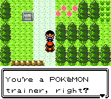
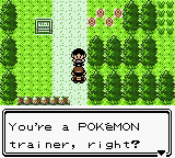
Ok. In the meantime, here is the first update for FractalFusion's GBC Pokémon Gold Version! Old: New: Now lets see if I can update an N64 one... EDIT: insert how stupid i am edit here
Here, my YouTube channel: http://www.youtube.com/user/dekutony
Editor, Experienced player (860)
Joined: 8/12/2008
Posts: 845
Location: Québec, Canada
Please try the Banjo-Kazooie one! (or THPS3)
Experienced player (690)
Joined: 11/23/2013
Posts: 2232
Location: Guatemala
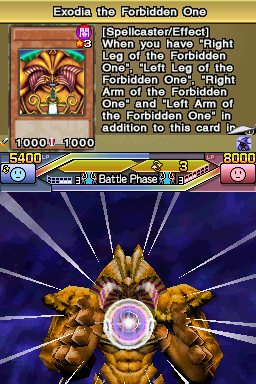
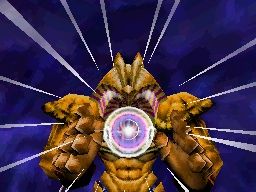
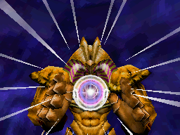
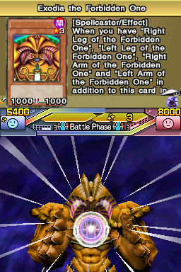
Woa requests!!! Ok. Second update on Hoandjzj's DS Yu-Gi-Oh! 5D's World Championship 2011: Over the Nexus! I decided to cut it to just to the bottom screen, or else the quality gets reduced quite a bit. Old: Submission: New..?: Yeah... the front screen was pointless anyways... but hey! I managed to get at least a decent quality with this one, it weights like 43.2KB or something, so that's quite nice!
Here, my YouTube channel: http://www.youtube.com/user/dekutony
Experienced player (690)
Joined: 11/23/2013
Posts: 2232
Location: Guatemala
Allright, heres my test image for a N64 screenshot: http://i933.photobucket.com/albums/ad175/tony_leal1/test4_zps6c1b7ec8.jpg What do you think? Its exactly 42663 bytes so I could say it looks nice enough.
Here, my YouTube channel: http://www.youtube.com/user/dekutony
Emulator Coder
Joined: 3/9/2004
Posts: 4588
Location: In his lab studying psychology to find new ways to torture TASers and forumers
Derakon wrote:
Honestly I don't see any difference between any of those screenshots.
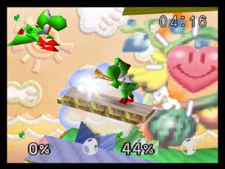
I know, right? Actually, I do notice one difference, Yoshi's tail in the upper left looks less jagged in the current one than the proposed ones. So I'd prefer it was left as is.
Warning: Opinions expressed by Nach or others in this post do not necessarily reflect the views, opinions, or position of Nach himself on the matter(s) being discussed therein.
Experienced player (690)
Joined: 11/23/2013
Posts: 2232
Location: Guatemala
Nach wrote:
Derakon wrote:
Honestly I don't see any difference between any of those screenshots.
I know, right? Actually, I do notice one difference, Yoshi's tail in the upper left looks less jagged in the current one than the proposed ones. So I'd prefer it was left as is.
Actually, they are not the updates, they are just some tests in comparison. The middle one has the correct pixels, but the other ones are a little bit blurry to fit its file size.
Here, my YouTube channel: http://www.youtube.com/user/dekutony
Emulator Coder
Joined: 3/9/2004
Posts: 4588
Location: In his lab studying psychology to find new ways to torture TASers and forumers
Kurabupengin wrote:
The middle one has the correct pixels, but the other ones are a little bit blurry to fit its file size.
The middle one looks the worst to me.
Warning: Opinions expressed by Nach or others in this post do not necessarily reflect the views, opinions, or position of Nach himself on the matter(s) being discussed therein.
ars4326
He/Him
Experienced player (777)
Joined: 12/8/2012
Posts: 706
Location: Missouri, USA
There's a clear difference in the GBC screenshot. It's more difficult to currently notice the difference on the DS and N64 ones, though. Looking good, though. Keep at it!
"But as it is written, Eye hath not seen, nor ear heard, neither have entered into the heart of man, the things which God hath prepared for them that love him." - 1 Corinthians 2:9
Experienced player (690)
Joined: 11/23/2013
Posts: 2232
Location: Guatemala
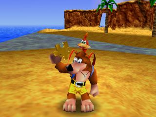
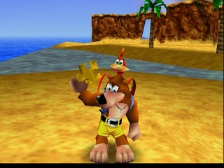
Sami O.'s N64 Banjo Kazooie "100%" got updated! Old: New: Yes, I know, its not the same frame, but for me its not a bad change, at least that black section is gone now.
Here, my YouTube channel: http://www.youtube.com/user/dekutony
Post subject: k then, i need to summarize this one.
Experienced player (690)
Joined: 11/23/2013
Posts: 2232
Location: Guatemala
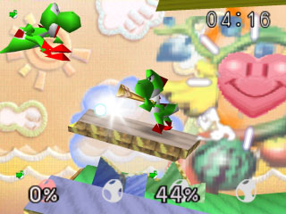
Blaze's N64 Super Smash Bros. got updated... Ok, since nobody will see a difference, I'll better explain some of them. Old: NEW: 1. Its resolution its correct this time. With this I mean that it now includes the black section that is in the actual game, so it isn't cut like the old one. 2. The JPEG quality increased, so yo will not see a lot of jpegish lowq pixels in it. 3. Its a little bit less blurry and its like 5% more correctly colored. If you still not see any difference, then... I have no idea. Just trust me... it has higher quality... please.
Here, my YouTube channel: http://www.youtube.com/user/dekutony
Experienced player (690)
Joined: 11/23/2013
Posts: 2232
Location: Guatemala
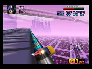
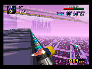
Lord Tom's N64 F-Zero X "Jack Cup, Time Trial" got updated! Old: New: This one looks less pixelated, just how Nach lieks it. I'm not sure how you can't see a difference in this one.
Here, my YouTube channel: http://www.youtube.com/user/dekutony
Experienced player (690)
Joined: 11/23/2013
Posts: 2232
Location: Guatemala
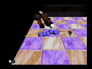
Nahoc's N64 Chameleon Twist got updated! Old: New (Less pixelated): Just Mortal Kombat and Mischief Makers left and I'm done with N64 for now.
Here, my YouTube channel: http://www.youtube.com/user/dekutony
Banned User
Joined: 3/10/2004
Posts: 7698
Location: Finland
Shouldn't they, in principle, look as close as possible to the original game played on the original console on a TV? Thus eg. bilinear interpolation of textures should be used only if the original console supported it?
Joined: 7/2/2007
Posts: 3960
Depends on the TV you're using though. A CRT renders images completely differently from an LCD. Hell, as I understand it different CRTs will have vastly different displays depending e.g. on how quickly their phosphors "decay". Since there's no objectively right answer, I'm inclined to say that whoever's going to the effort of making the screenshot should use the approach that looks best to them, and if someone disagrees then the two of them can hash things out.
Pyrel - an open-source rewrite of the Angband roguelike game in Python.
Experienced player (690)
Joined: 11/23/2013
Posts: 2232
Location: Guatemala
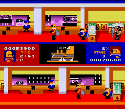
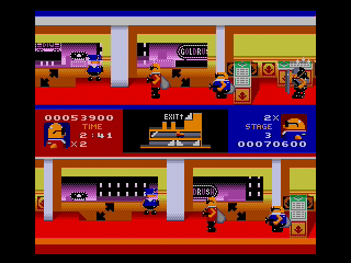
SprintGod's Genesis Bonanza Bros. got an update! Old: New: It got brighter and the black sections are gone now!
Here, my YouTube channel: http://www.youtube.com/user/dekutony
Spikestuff
They/Them
Editor, Publisher, Expert player (2642)
Joined: 10/12/2011
Posts: 6438
Location: The land down under.
Kurabupengin wrote:
Second update on Hoandjzj's DS Yu-Gi-Oh! 5D's World Championship 2011: Over the Nexus! I decided to cut it to just to the bottom screen, or else the quality gets reduced quite a bit. Yeah... the front screen was pointless anyways... but hey! I managed to get at least a decent quality with this one, it weights like 43.2KB or something, so that's quite nice!
I dropped mine to 39.2kb before doing any fancy shit to it (This is a corrected version which removes the top screen like Kura's). I have now dropped the size to 32.7kb Also use edits for each of your updates. Old: New but not compressed: New compressed: (Note: I still had my screenshot file for this, I didn't use Kura's or the Publication)
WebNations/Sabih wrote:
+fsvgm777 never censoring anything.
Disables Comments and Ratings for the YouTube account. Something better for yourself and also others.
Banned User
Joined: 3/10/2004
Posts: 7698
Location: Finland
Derakon wrote:
Depends on the TV you're using though. A CRT renders images completely differently from an LCD. Hell, as I understand it different CRTs will have vastly different displays depending e.g. on how quickly their phosphors "decay". Since there's no objectively right answer, I'm inclined to say that whoever's going to the effort of making the screenshot should use the approach that looks best to them, and if someone disagrees then the two of them can hash things out.
OTOH things like bilinear filtering of textures has nothing to do with the display, so shouldn't the filtering be the one that was actually used on the console? As for LCD, I don't think the N64 had anything else than analog video output (composite and S-video).
1 2
5 6