For your information, I fixed a bug with the rating indicator that caused low ratings (indicated in blue tones) to be indicated in too bright a colour, often causing a bright white spot on the low region even when relatively few ratings actually occur on that region.
It was a miscalculation in the mixture of HSV & YUV colorspaces aiming to calculate a realistic brightness value representing the rating's strength in that particular region.
Here's how the colours work.
On X axis, is the hue. It indicates the value of the rating. 0 = on the left side, 10 = on the right side.
On Y axis, is the brightness. It indicates the popularity of that particular rating option. Top = Nobody has voted that option, bottom = most people have voted that option.
Here's how the colours used to be indicated, when it was buggy.

Here's how they are indicated after the bug was fixed.

Here's how they would be indicated if the relative brightness differences of red, green and blue were
not observed in the calculation (i.e. a full blue would be treated as equally bright as a full green):

I'm kind of torn how to actually go ahead with the colours :I


 How can a run have 78.5 votes? Is the 0.5 vote for a vote that rated only entertainment or only technical? Again, sorry if this is the wrong thread.


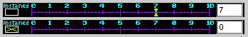 The voter can be deceived with the checked "Abstained", but acctually the vote is 0 for Tech.
It has already been fixed by Bisqwit, though.
The voter can be deceived with the checked "Abstained", but acctually the vote is 0 for Tech.
It has already been fixed by Bisqwit, though.


