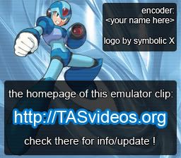
Nice work with the art, except for the following considerations:
1) Our videos are commonly 256x224, not 256x240. At 256x224, your first logo looks like this:

2) The message is wrong. The role of tasvideos.org is not to be "a download site", but that of a center of TAS-related information. I don't care where people download these TASes.
In order words, though the URL is important, it is not there so that one can say "downloaded from". It is there so that one can "find more (information)" at that site.
More information:
http://tasvideos.org/EncoderGuidelines.html#Logo
3) The text will be horribly unreadable on interlaced displays. I'm also worried at what a video codec does to such small details.
4) Oh, and the URL is practically invisible at first sight due to the low contrast.
That said, why does Maverick have such feminine shape of body? Even though the face is masculine, the shapes are such that only females can cosplay it with whatever little dignity. :)

 2) The message is wrong. The role of tasvideos.org is not to be "a download site", but that of a center of TAS-related information. I don't care where people download these TASes.
In order words, though the URL is important, it is not there so that one can say "downloaded from". It is there so that one can "find more (information)" at that site.
More information:


 I haven't gotten any complaints yet.
EDIT:
